ARTimus Prime is your destination to check out all the projects going on at the Fountain Lake Cobra Digital Prep Academy. Bookmark this page to check back here all year to see what we are doing in the Art Room and to keep up with all of your assignments.
During this lesson, we will take a look at graphic design, basic color theory and different color schemes used in art.
After completing a color theory worksheet you will create four unique soda can designs. Each can must include a different color scheme,different logo, design, and original name. We will also take a look at the graphic design process and discuss logos in society.
For now take a look at the websites below to get some inspiration and instruction in color theory and graphic design.
HERE is a site on basic color theory that lists some color schemes.
Here is a video that will explain all ten color schemes that are discussed in class and on your worksheet.
Day 1- Color Theory Intro
Compelete the worksheet on color theory.
Day 2-4 Soda Can Logo Designs
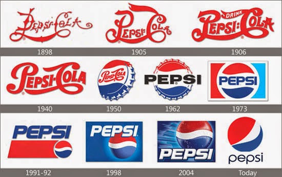
After looking at the color theory information and completing the worksheet, you will begin creating logos for your soda cans. Before you begin that here are a few examples of logos and a LINK to a website about logo evolution for you to look at.
As you create your logos for your soda cans, keep in mind that artists try and incorporate an image and text into one, easy to read, interesting design. Here is one more LINK to an article showing 50 different logos that contain a hidden meaning.
Soda Can Designs
Each can must contain a different name and logo design.
Each can must use a different color scheme. Label each can with the appropriate color scheme.
Our next project will take a look at Pop Art and Andy Warhol. You will be creating your own soup cans based on pop culture references that are relevant to you.
Watch this video to hear about Andy Warhol and why his soup cans are significant in the world of art.
Now take a look at the first slideshow below for an intro to your project
After you finish watching this slideshow you will begin brainstorming your soup ideas. Use the worksheets that I provided for this step.
After you finish brainstorming and your ideas are approved by me you can take a look at the second slideshow.
The second slideshow has more in depth instructions that explain how to make your soup cans.
This project will put you in the position of a graphic designer as you work to create a new package design for your candy bar creation. You will use the design process to create your candy bar. For your final piece, you will use Photopea.com to create your design.
The Graphic Design Process
When starting a new design project, there are steps of the graphic design process to follow that will help you to achieve the best results. Rather than jump right into a graphics software program to try to create a final version, you can save yourself time and energy by first researching the topic, finalizing your content, starting with simple sketches and getting several rounds of approval on designs.
We will use the graphic design process above as a guide for this project.
WEEK 1- Steps 1-4
1. Define the task:
What kind of bars will you make?
Who is your target audience?
What are your candy bars made out of?
2. Research
Gather ideas and make notes about candy bar design.
3. Brainstorming
Begin thinking about your idea. Create a mindmap to help you brainstorm.
Thumbnail sketches do not have to be in color and are not finished drawings.
You should create at least 4 original ideas for this step.
WEEK 2- Steps 5-8
5. Design Direction Develop 3 of your ideas from your thumbnails. These ideas should be in full color.
6. Tight Sketch This is your final design. 7. Client Review Bring your tight sketch to be reviewed by the teacher. 8. Finalizing Design your bar on Photopea.com
Finish your piece by wrapping the cardboard candy bar. After your wrap your bar, write a paragraph that describes your candy bar and glue it to the back of your bar.
During the Renaissance one artist was centuries beyond his time--Giuseppe Arcimboldo. While the Great Masters such as Michelangelo and Raphael focused on rendering human figures realistically, Giuseppe Arcimboldo created surreal portraits of his subjects made of vegetables, plants, fruits, sea creatures, tree roots, and books. In this class we will create our own paintings mimicking Arcimboldo’s unique style using fruits and vegetables.
Giuseppe Arcimboldo(also spelled Arcimboldi; 1527 - July 11, 1593) was an Italian painter best known for creating imaginative portrait heads made entirely of such objects as fruits, vegetables, flowers, fish, and books - that is, he painted representations of these objects on the canvas arranged in such a way that the whole collection of objects formed a recognizable likeness of the portrait subject.
Arcimboldo was born in Milan in 1527, the son of Biagio, a painter who did work for the office of the Fabbrica in the Duomo. Arcimboldo was commissioned to do stained glass window designs beginning in 1549, including the Stories of St. Catherine of Alexandria vitrage at the Duomo. In 1556 he worked with Giuseppe Meda on frescoes for the Cathedral of Monza. In 1558, he drew the cartoon for a large tapestry of the Dormition of the Virgin Mary, which still hangs in the Como Cathedral today.
CLICK THIS LINK TO VIEW ARCIMBOLDO'S COMPLETE WORKS ->
UNITY - A principle of art, unity occurs when all of the elements of a piece combine to make a balanced, harmonious, complete whole. Unity is another of those hard-to-describe art terms but, when it's present, your eye and brain are pleased to see it. VARIETY - A principle of art concerned with combining one or more elements of art in different ways to create interest.
How does Arcimboldo create unity in his artworks?
How does Arcimboldo create variety in his artworks?
How will your create texture on your items to make them look realistic?
YOUR PROJECT is to create a portrait of a person using vegetables, fruits, or other objects to make the person's face.
You may use any items you would like to make your person. Like Arcimboldo, your items should all relate to each other to create a theme for your portrait.
AR Standards: CR1.6.2 CR2.6.1 R7.6.1 R8.6.1 CN11.6.1
Our next project will take a look at the art of mosaics and stained glass. Mosaics have a long history, starting in Mesopotamia in the 3rd millennium BC. They were typically made from clay tiles, pebbles and sometimes glass. They often depicted religious subjects or were purely decorative. You will be able to choose any photo you would like to create for your mosaic and we will discuss how to use the Google Drawing tools in class. Take a look at the links below for inspiration and some of my examples in the photos.
Our next project takes a look at contemporary artist Eric Joyner and creating a metallic effect with colored pencils by blending them together.
Contemporary art is the art of today, produced by artists who are living in the twenty-first century. Contemporary art provides an opportunity to reflect on contemporary society and the issues relevant to ourselves, and the world around us.
Take a look here for more examples of contemporary art:
In 1999, I started to enter various juried shows at Artisans Gallery in Mill Valley, CA. and the work was well received. Shows in other galleries, (usually group shows) were positive as well. In 2000, after years of painting other people’s pictures, I made the decision to only paint things that I liked. Four series of paintings of different subjects were started; they were: San Francisco urbanscapes, paintings of old newspaper cartoons characters, Mexican masks, and last but not least, Japanese tin (toy) robots. Though all four series of these subjects were enjoyable to do, I chose to focus on the tin robots, as they were the most popular and seemed to have the most possibilities.
So, armed with a small collection of tin robots and spaceships I began painting them in earnest. In attempt to bring them to life without losing their charm, I showed them where they belonged: outer space. By 2002 the paintings were looking good, but they still needed something to play off of… perhaps a nemesis. After a month or so of searching for a ‘nemesis’ I had an epiphany while watching the movie ‘Pleasantville.’ In one of the scenes, Jeff Daniels paints a still life of…donuts. With thoughts of Wayne Thiebaud’s pastries always close at hand, it wasn’t difficult to see the battle scene of robots retreating from 300-foot tall donuts when I went to bed that night. The rest, as they say, is history.
This video is a tutorial showing some different colors you can blend together to create some metallic textures.
Directions:
Create a robot artwork inspired by Eric Joyner.
Add donuts (or another type of sweet treat) to your robot drawings like Eric Joyner.
Create a metallic texture on your robot using the blending techniques we worked on in class.
There are many robot part examples below here for inspiration.